Wednesday, August 12, 2020

The faceless


This is a daily figure exercise from a few months ago and I'm posting it here as a means to explore something I've found to be a bit puzzling about our time. 

Although it's difficult to tease out what is genuinely authentic on social media sometimes—I've noticed a common trend or theme among much of the modern figure work I've encountered; the public doesn't really care to see the faces of people they don't know. At all. Especially if they are attached to a figure. And this is something I've increasingly become aware of when posting drawings or paintings of my own work to social media.

Maybe it's always been this way to some extent or another and I've just never noticed it. But, I look at the work of accomplished contemporary American artists like Zhaoming Wu or Steve Huston, and nearly all of their work that includes a figure or body discludes the face of the subject. Or in the least, their identity as a person is mostly obscured. And this trend goes beyond just the work of contemporary American artists. It extends to mannequins as well and to items as obscure as faceless angel figurines on Amazon.

Artist: Zhaoming Wu

Artist: Steve Houston

Faceless Mannequins 

A Faceless Angel Figurine

In all the history of art and western culture I don't think there is a period prior to the last 30 or so years where this was a cultural trend in design and art. And I have yet to encounter any kind of cultural historian who has articulated this—or confronted as to why this has happened. 

As an artist, who has spent a lifetime working to understand and communicate the intricacies and nuances of expression transmitted by the human face—I've found this to be incredibly strange. Christ, there is an entire area in the brain purely dedicated to perceiving faces; the fusiform gyrus. And there's really not that many famous or beloved figurative works prior to the late 20th century where the figure's identity is unimportant or deliberately obscured. 

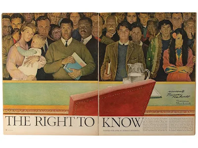
How is it now that we don't want to look at the face of humanity? Especially when it comes to strangers or unfamiliar faces. If one looks at art work in popular culture prior to the 80s, especially in commercial illustration, it is filled to the brim with human faces of all types. And Norman Rockwell is a perfect example of this. It's nearly all quirky, idiosyncratic, everyday strangers—the common man/woman. 

The Right To Know Norman Rockwell, 1968

Although I can't claim to wield the intellectual tool set or resources to confront this question in depth; I most definitely think something has happened on a deep cultural level in the last 30-40 years that has been traumatic in ways we see one another (strangers in particular) and it's gone on mostly unrecognized by the wider culture. Especially in America. 

Tuesday, July 14, 2020

Pastel returns...again


⁣⁣These are some recent experiments with color and pastel. There is something incredibly arresting and radiant about pastel—it's brilliance. And in a season that seems so incredibly dark at times; a little color and brilliance feels like an unarticulated necessity.⁣⁣


Monday, June 1, 2020

Daily Figure 6-1-2020


Started using Cretacolor's XL Nero Art Sticks here for light values and halftones in place of the Prismacolor Art Stix. They're less waxy. And wider. Much wider. So they cover a lot more ground in less time while still allowing for sensitive restraint in building-up values. Which suits them well for life drawing—where time and control are at a premium due to the fatigue factor forever taxing the model.

Wednesday, February 26, 2020

Daily Figure 2-26-2020


There is something so striking about an untouched solo mark. Pure. Unfussed. To the point. Efficient. Using a massive chunk of charcoal here on those large peripheral strokes.   

Monday, January 27, 2020

Daily Figure 1-27-2020


Using a multitude of various charcoals and tools here. Of particular usefulness as of late: Prismacolor Art Stix for upper-tier halftones and incredibly light values. It doesn't play with other media so well due to the strong wax content and a heavy application really puts this into high relief; but strategically used—it's perfect for gentle, light, and subtle gradations of value. Especially on really light or bright white surfaces where subtle slight value shifts can be difficult to keep tamed.   

Tuesday, November 5, 2019

Not filling in the shadows


In having spent so much time drawing from life—you are continuously forced to make editing choices due to the time limit of the pose. What to include, what to exclude. Over time, I've come to appreciate that this creates it's own aesthetic. As in life, sometimes the things left unsaid are more beautiful than anything manifestly expressed. 

Tuesday, October 22, 2019

The forever moving target


A recent exercise in drawing the figure from reference with a bit of experimentation in tools—using one brand of compressed charcoal for the core shadows and another to fill in the shadowed sections. Whereas one of the brands (Cretacolor) is much more loosely bound and softer, and the other (Conté à Paris) is much harder. I used the softer of the two for the core shadows and the harder for the fill shadows and mid-tones.

 The advantage with this approach was that a dark registration of the shadow cores was quick and easy with the softer charcoal, and then I could more easily control the structural reveal of the forms in the half-tones and fill shadows by using a slower application process with the harder charcoal. Using the harder charcoal was particularly useful in taming the level of reflected light bounced into the shadow fills—so that the nuances of the anatomical construction were retained with subtle fidelity.

There's a tendency for many to use the same tool or approach in their work over and over, as it's how they were taught. I did this myself—often. For years in fact. Although as I've learned, and come to enjoy—the application of specific tools and techniques for specific circumstances is so much more effective in terms of speed, control, and/or effect. It just takes some time to work through where, when, and how to go about it. And it seems that this process is never complete nor is there an approach that is 100% applicable to every circumstance or subject. Failure is a constant. Every work it seems, in some manner or another, requires a kind of special consideration—if you're really paying attention. Even a 5-minute drawing.